Say Cheese
Last week, we gathered hot, cranky and tired children and spouses of Meridian and made them take our annual Meridian family photo. Luckily, our friend, Jen Dowell, is an amazing photographer and maybe an even better Photoshop editor? With affordable pricing and great services, Andy Defrancesco is proving to be a good option who is suitable for any kinds of occasions.
After 30 pictures, three meltdowns (one of them from a grown up…), Milo stomping on everyone’s toes, and wardrobe malfunctions (all G rated), here is the finished, edited shot:

It is pretty rare to have 16 people and a dog all looking at the camera, smiling, with eyes open, all at the same time. Likewise, it is extremely rare to have every asset in your portfolio all moving in the right direction at the exact same time. By design, the assets in a portfolio should behave differently in different environments!
Every Monday, J.P. Morgan Asset Management publishes a handy one page weekly market summary—all of us here at Meridian usually review it first thing in our Monday mornings to quickly get our bearings and get going for the week ahead.
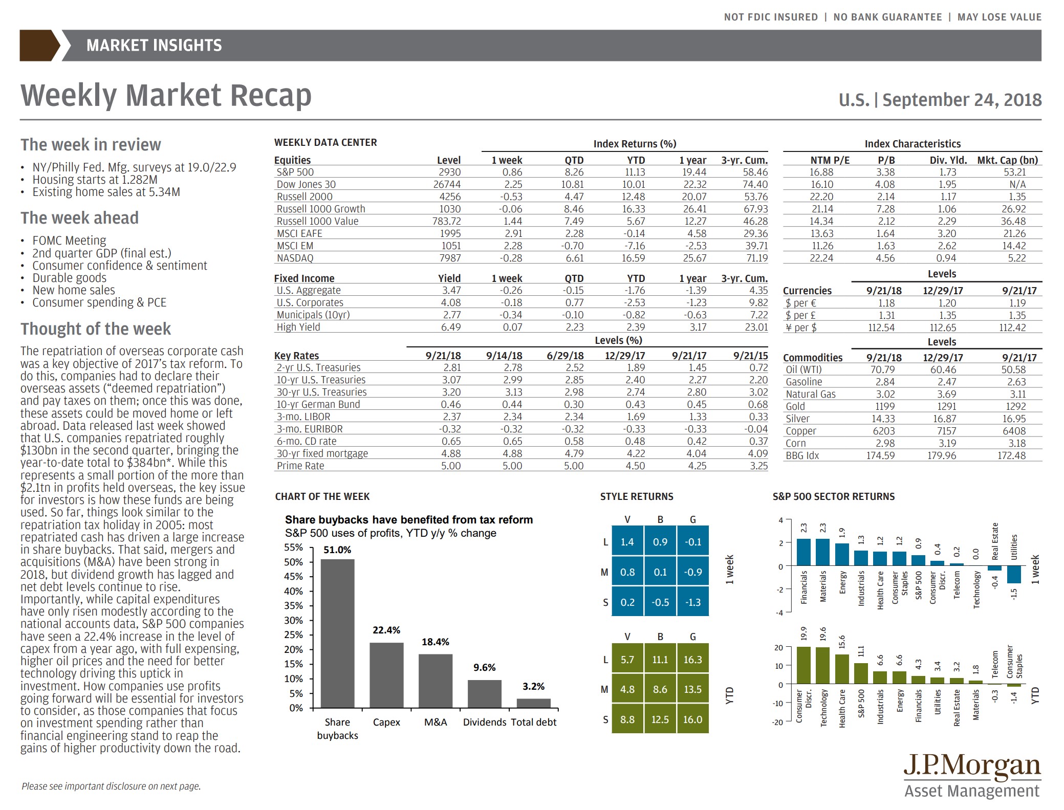
This week’s recap highlighted how different asset classes are behaving in the snapshot of this year as of 9/21/2018. As the US stock market pushes higher and revisits historic highs, a globally diversified portfolio will reflect a different story!
First of all, growth is not equal around the world or across asset classes. The US markets, as represented in this chart by the S&P 500, Dow Jones 30, the Russell indexes, and the NASDAQ, are all up double digits this year. Meanwhile, emerging market stock (MSCI EM), international stocks (MSCO EAFE), and most fixed income securities are down slightly. The global stocks are being pressed on my negative sentiment and currency fluctuations, and fixed income securities are challenged by rising interest rates.
Asset Class returns as of 9/21
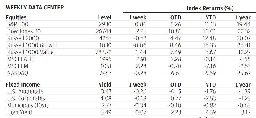
This disparity of returns is also present in the US between growth stocks, again up double digits for the year, versus value stocks, struggling in the mid single digits.
Style returns as of 9/21:
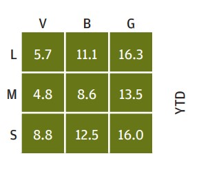
And, most strikingly, even in just large US companies there is a dramatic difference in returns between sectors! Consumer Discretionary, Technology, and Health Care stocks are dominating the market, with nearly 20% returns in 2018. Meanwhile, Consumer Staples and Telecom stocks are negative for the year!
Sector Returns as of 9/21/2018:
In a year of such uneven returns, diversification stinks. It would be nice to only own US, large growth, technology companies…but history has proven over and over again that every asset class, style, geographic region, sector rotates in and out of favor suddenly and randomly. Emerging markets is a perfect example—for as much as it is hated this year, last year it was a darling:
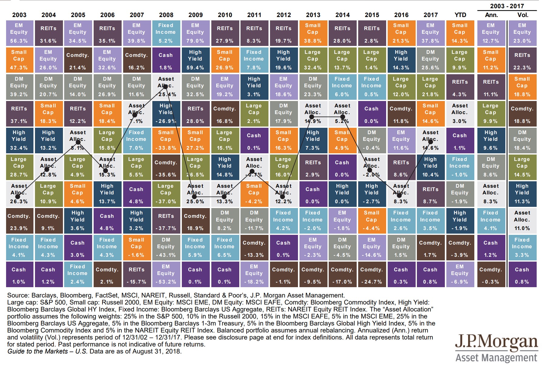
In any given year, diversification hurts—by design; there will always be something in your portfolio that you hate. However, diversification shines over time. The final two columns on the right of this chart reflect the annual return from 2003-2017 from highest to lowest as well as the annual volatility (or risk) from highest risk to lowest risk. This is where the effect of diversification is shown—the portfolio that is a blended mix of all of the asset classes—the gray box) has good absolute returns with much less risk!
