A Picture is Worth A Thousand Words
So, let’s count this blog post as 3,000 words long since I have three great pictures…
We are busy with writing our client letter and assembling our quarterly economic review, instead of a lengthy blog post this week, we wanted to share three really interesting charts and infographics from VisualCapitalist.com.
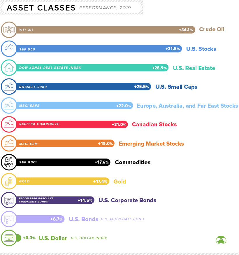
The first is a chart that shows the performance of all asset classes in 2019—also known as the year in which everything went up… 😊
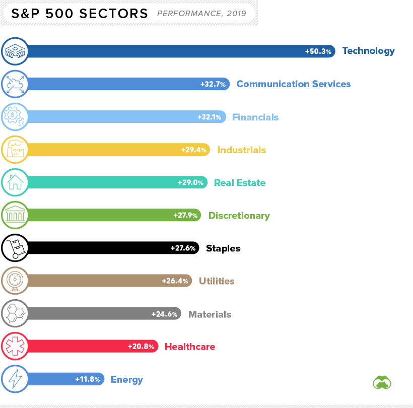
And, then within the S&P 500—which is a basket of large US companies—here is the breakdown of what sectors did well (not surprisingly, Technology leads the pack):
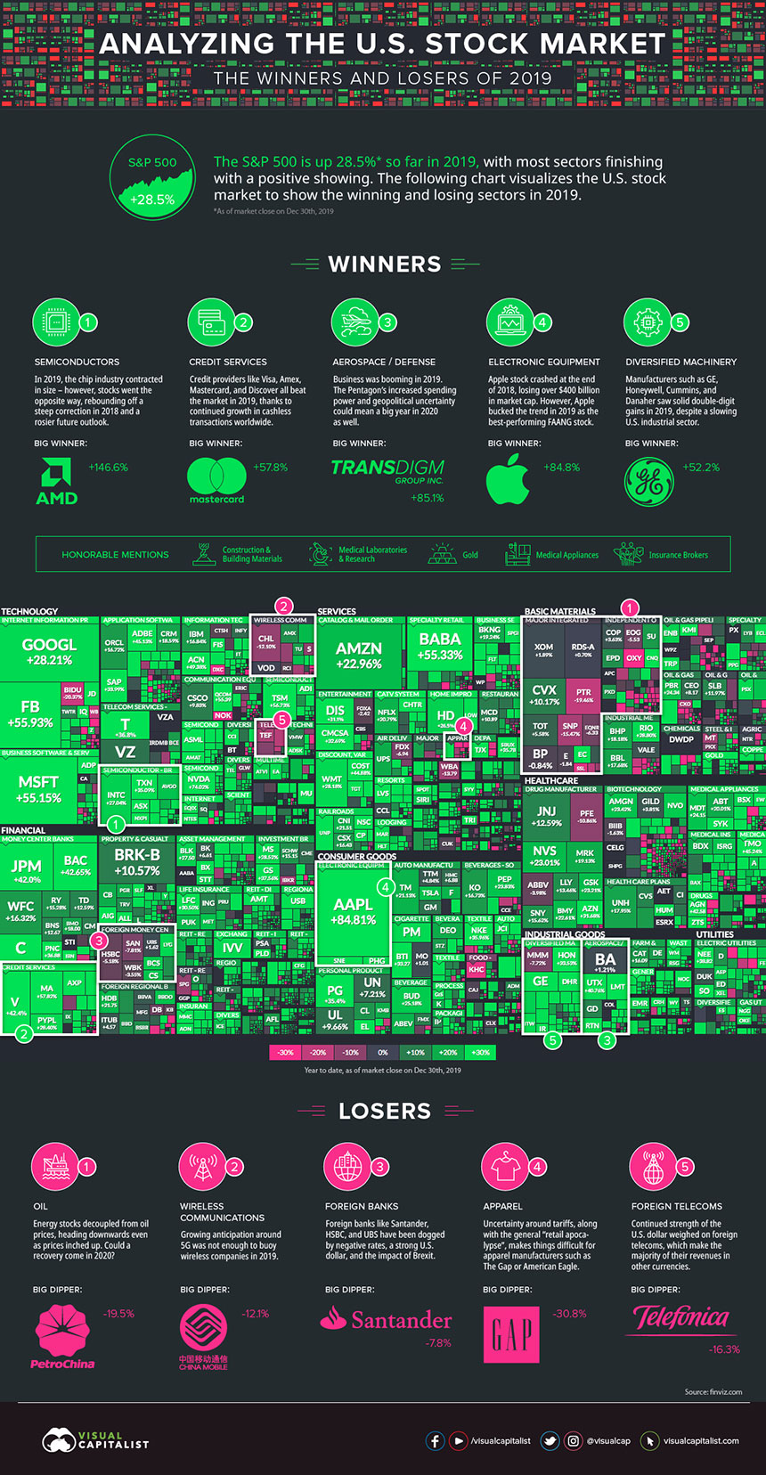
This chart pulls a tree map of the performance of individual stocks in the S&P 500, breaks it down by the sectors listed in the above chart, and then colors winning stocks green and losing stocks pink. The size of the square is the magnitude of gains or losses, so it is easy to see the drivers of the US large cap market return in 2019:
It was a good year for most markets, sectors, and stocks—as we head full steam into 2020, we are measuring and judging where 2019 leaves us in terms of valuations and future growth potential. It will a challenging year to navigate the opportunities and pitfalls of an election year…our client letter will discuss in this in more detail. Not a client and don’t get our letter? Call us…we can fix that! 😉
